There is a moment that almost every designer knows. You open Instagram, or Pinterest, or a trend report, and something clicks. A mood, a colour, a motif. You feel inspired. You save thirty images. You open your sketchbook. And then… nothing. Or worse — you start drawing, and halfway through you realise you are essentially recreating something you already saw. The excitement deflates. The work feels derivative. You close the sketchbook and scroll again, hoping for a spark that feels a little more yours.
If this sounds familiar, you are not alone. And you are not failing at being creative. You are simply navigating one of the most honest tensions in design: how do you stay relevant without becoming a copy?
This post is my attempt to work through that question — not with vague advice about “finding your voice,” but with practical tools, honest reflections, and a framework for using 2026 pattern design trends as creative fuel rather than creative constraint.
Why Trends Feel So Overwhelming (And Why Everyone Starts to Look the Same)
Let’s be honest about what trend culture can do to an artist at the beginning of their journey.
When you are still building confidence in your work, trends can feel less like inspiration and more like a checklist. You see that celestial motifs are everywhere. You see the mushroom illustrations. The maximalist floral wallpaper. The textured, imperfect linework. And because you are trying to build a business — trying to understand what sells, what gets saves on Pinterest, what attracts buyers — you start making decisions based on what they are doing rather than what you feel called to make.
The result is something every creative industry experiences in waves: a sea of sameness. Open Etsy and you will find hundreds of shops selling variations of the same trending illustration style. Browse surface pattern marketplaces and you will see the same motifs, the same palettes, the same compositional choices — all slightly different, but fundamentally echoing each other. No one copied anyone intentionally. They were all just following the same trend.
This is what happens when we treat trends as templates.
The problem is not the trends themselves. Trends exist because they reflect something real — a collective mood, a cultural hunger, a shared visual language that resonates at a particular moment in time. There is genuine meaning in why maximalist florals are having a moment, or why people are craving handmade imperfection. The problem is what happens when we skip past that meaning and go straight to replicating the surface.
When we chase what a trend looks like, we produce work that competes in a crowded marketplace. When we chase what a trend feels like, we produce work that is unmistakably ours — and paradoxically, far more commercially interesting because of it.
That distinction — look vs. feel — is the entire thesis of this post. Let’s get into it.
The 2026 Pattern Design Trends Worth Knowing
Before we talk about how to interpret trends rather than copy them, it helps to know what is actually emerging right now. Here are five significant directions shaping surface pattern design in 2026, and more importantly, the feeling behind each one.
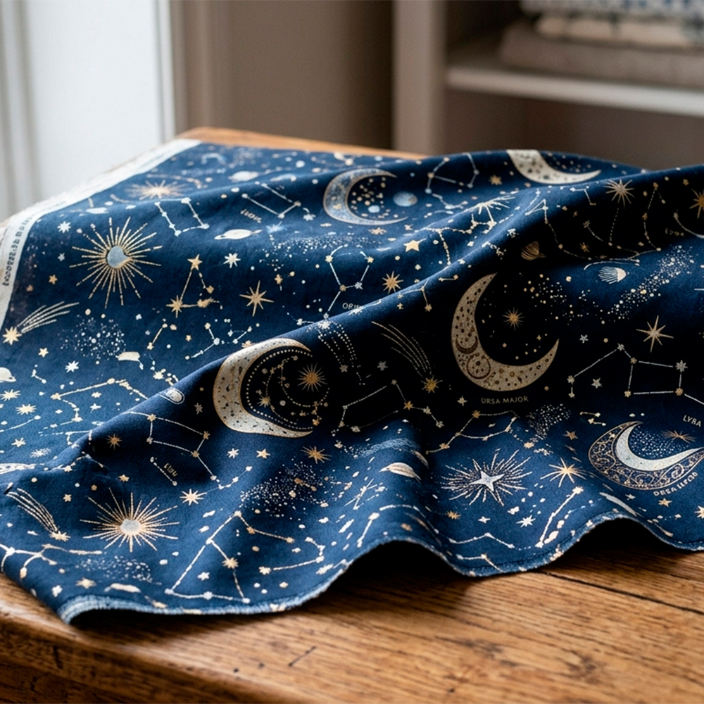
1. Celestial & Cosmic Wonder
Stars, moons, constellations, planets, and cosmic mythology have been quietly building for a few years, but 2026 sees them maturing into something richer and more layered than the boho moon-and-stars aesthetic of recent years. Think deep indigos and midnight blues with gold and rust, ancient astronomical charts reimagined, the mysteries of the universe rendered with a sense of reverence and awe. This is not just “stars on a dark background.” It is something that asks: what does it feel like to be small in an infinite universe, and find that comforting rather than terrifying?
The feeling: Wonder. Stillness. Ancient wisdom. The comfort of looking up.
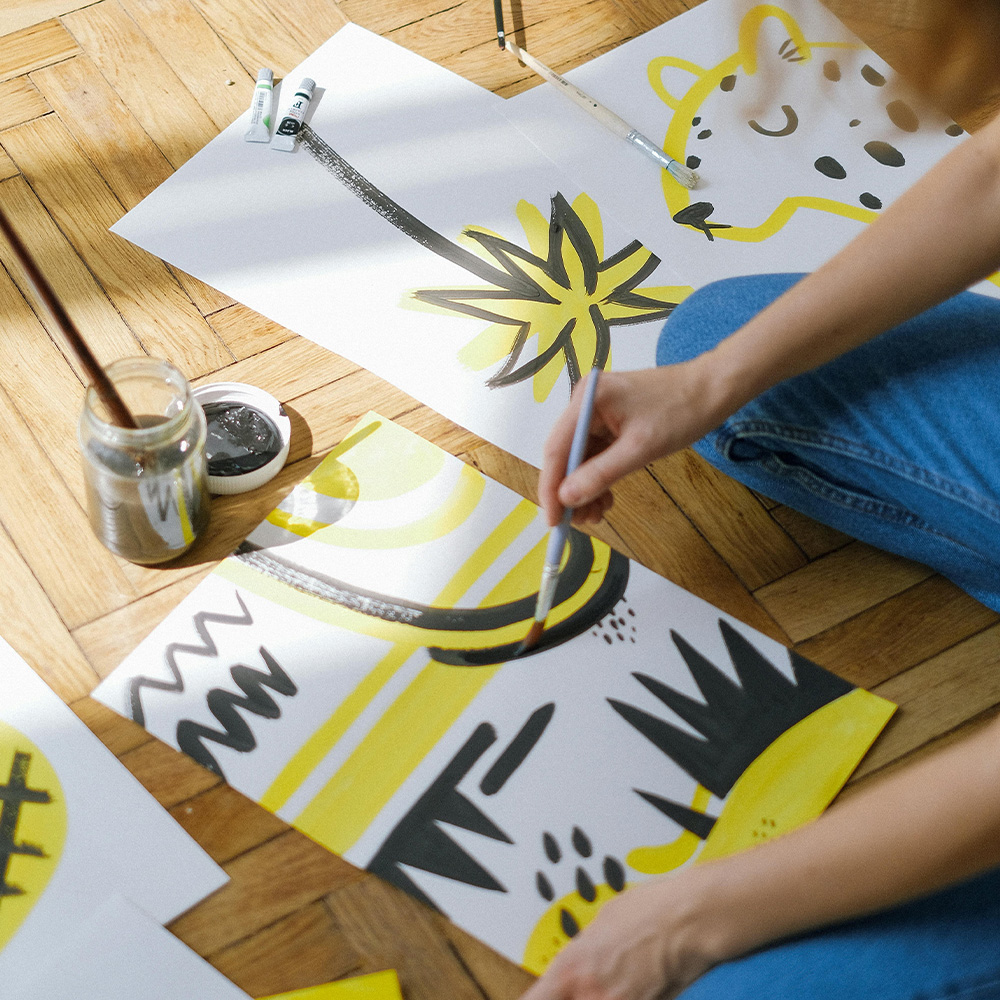
2. Artisanal Imperfection & The Human Touch
In a world of AI-generated perfection and algorithmically polished content, there is a profound cultural hunger for evidence that human hands were involved. 2026 is seeing this everywhere — in hand-drawn linework that wobbles slightly, in blurred edges, in patterns that look painted or printed by hand. The Surface Design Show in London this year showcased designers deliberately introducing texture and irregularity into their work. Imperfection is not an accident; it is the point.
The feeling: Warmth. Authenticity. The satisfaction of craft. Something real in a digital world.
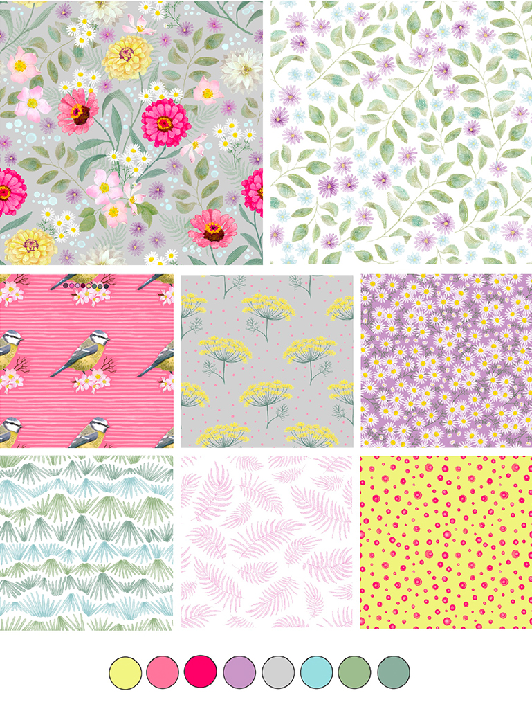
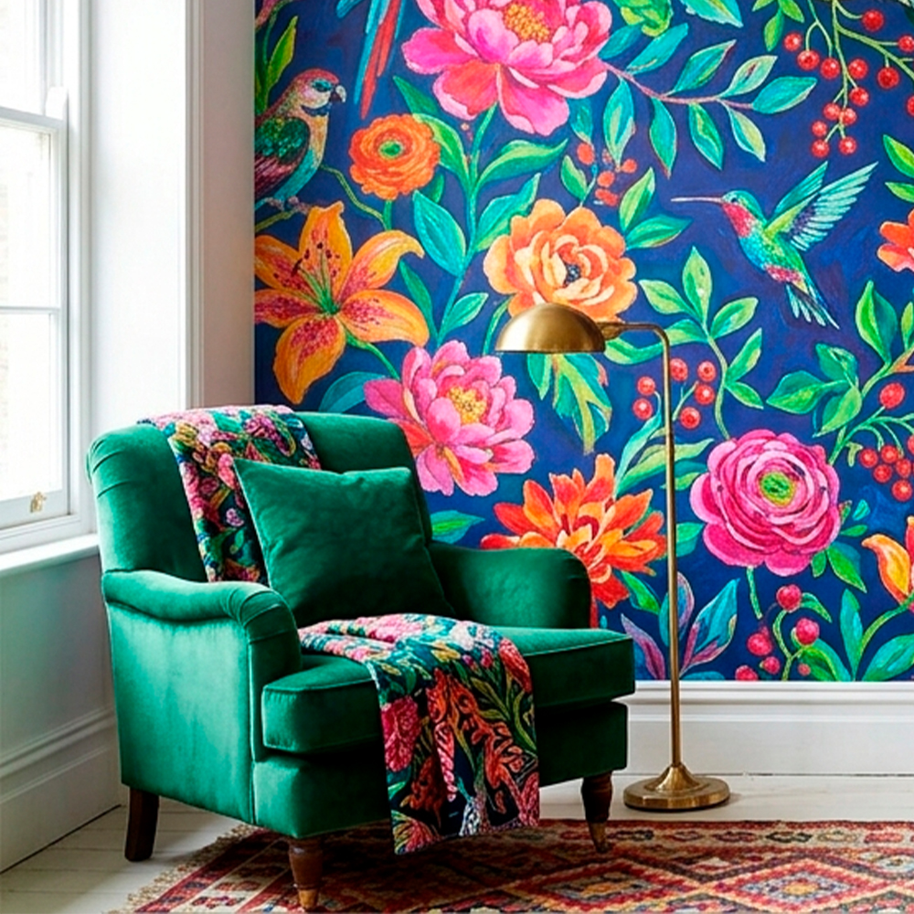
3. Maximalist Botanicals & Oversized Florals
Nature motifs have never gone away, but 2026 takes them bigger, bolder, and more expressive. We are talking about florals that fill the entire repeat, botanicals rendered with drama and confidence rather than delicate restraint. This is less “pretty wildflower meadow” and more “the garden taking over.” Rich, jewel-toned palettes, exaggerated scale, a sense of lushness that borders on the theatrical.
The feeling: Abundance. Joy. Wildness. The feeling of walking into an overgrown greenhouse in summer.
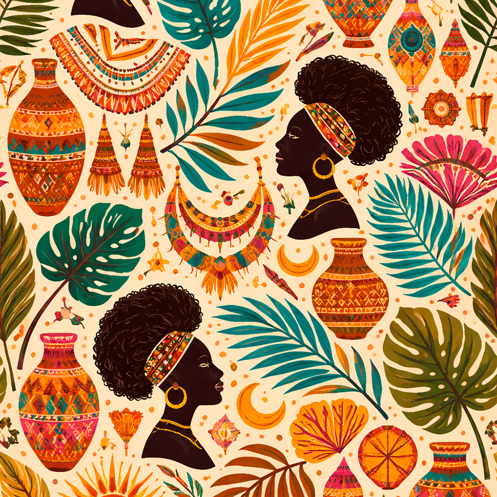
4. Afrohemian & Global Craft Fusion
One of the most significant cultural movements in surface design right now — identified in the Pinterest Predicts 2026 report — is the embrace of global craft traditions, particularly those rooted in African, South American, and Southeast Asian aesthetics. Earthy palettes, woven textures, hand-drawn symbols, tribal-inspired geometric motifs, and the warmth of materials like terracotta, rattan, and natural fibres are all part of this direction. It is bohemian in spirit but rooted in something far older and more specific.
The feeling: Warmth. Rootedness. The richness of cultural memory. The feeling of a market in Marrakech or a woven textile bought on travels.
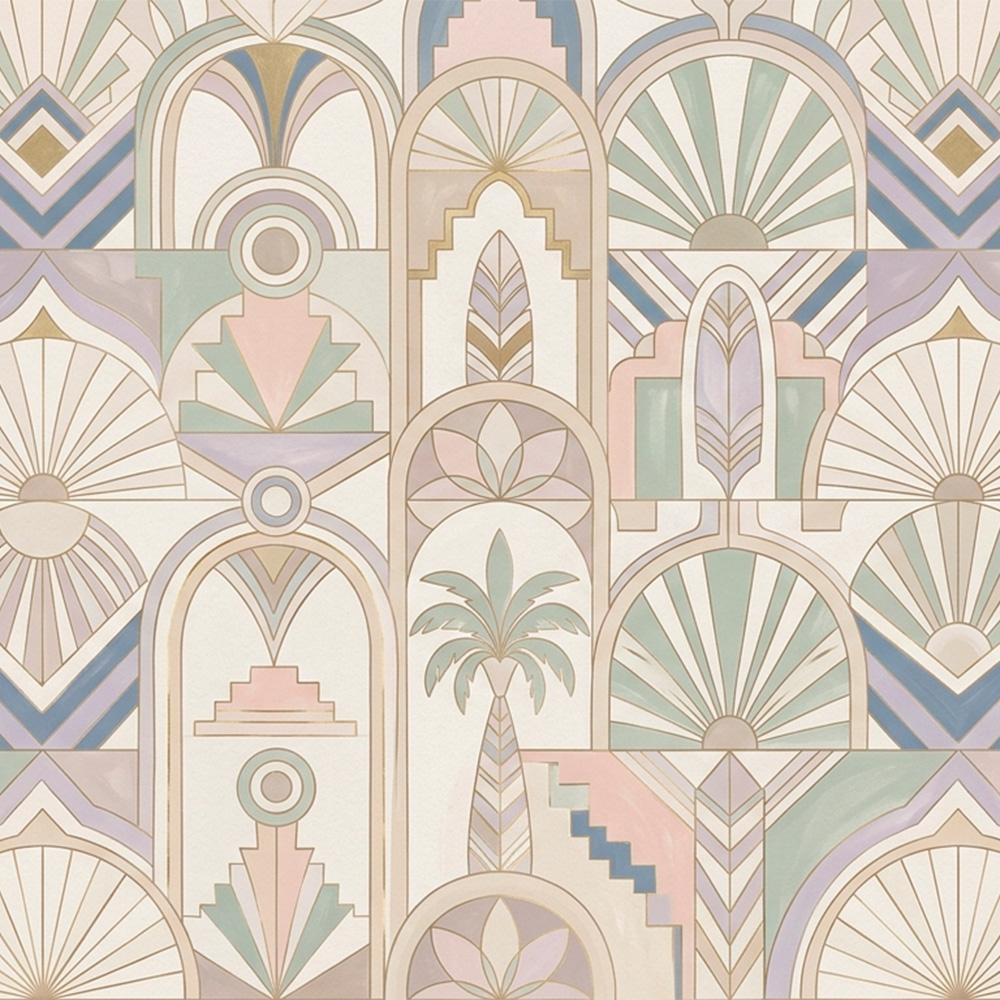
5. Neo Deco & Graphic Geometry
Art Deco has always had a presence in surface design, but 2026 sees it reimagined with contemporary colour and a slightly more playful energy. Clean lines, symmetry, bold graphic shapes, arches and fans and geometric repeats — but freed from the formality of historical Deco and brought into something that feels fresh and almost architectural. This is showing up in interior tiles, wallpaper, and print design with increasing frequency.
The feeling: Order. Elegance with a wink. The satisfying click of symmetry. Confidence.
Trends Are Something to Interpret, Not Copy
Here is the shift in thinking that changes everything.
A trend is not a brief. It is a signal.
When trend forecasters identify “celestial motifs” as a rising direction, they are not saying: draw a moon and some stars on a dark background. They are saying: there is something in the cultural moment right now that is making people hungry for this particular feeling — wonder, cosmic perspective, a sense of something larger than everyday life. That is the trend. The moon and stars are just one possible visual answer to it.
Your job — as a designer with a distinct life, perspective, history, and aesthetic — is to find your visual answer to that feeling.
This is the difference between a designer who produces ten celestial collections that all look like each other, and a designer whose celestial collection is completely unmistakable. Both drew inspiration from the same trend. Only one of them asked the right question first.
The right question is not: what does this trend look like?
The right question is: what does this trend feel like — and what in my own life, memory, imagination, or way of seeing connects to that feeling?
The Practical Guide: How to Translate a Trend Into Your Own Style
Step 1: Sit With the Feeling Before You Touch a Pencil
This is the step most designers skip, and it is the most important one.
Before you look at any more images, before you search Pinterest for “celestial pattern design 2026,” close the laptop. Sit with the name of the trend. Say it out loud if it helps. Then ask yourself:
- What does this word or idea bring up in me?
- What memory does it connect to?
- Where have I felt this feeling in my own life?
If the trend is celestial, maybe you remember lying on the grass as a child, watching the stars appear one by one. Maybe you have a grandmother who believed in astrology. Maybe you feel it most on long winter evenings when the sky goes that specific shade of blue just before dark. Maybe it connects to your love of mythology, or to a piece of music, or to the feeling of being alone and not minding it.
None of that is the trend. All of it is your access point into the trend.
Write it down. Fill a page. Don’t filter yourself.
Step 2: Run It Through Your Senses
Trends are usually described visually, but your creative response doesn’t have to start there. Try running the trend through your other senses first, using these prompts:
What does this trend smell like? Celestial might smell like cold night air, or incense, or the dusty pages of an old atlas. Maximalist botanicals might smell like a florist’s shop, or cut grass after rain, or the green-sharp scent of tomato plants in summer.
What does it sound like? Artisanal imperfection might sound like the scratch of a lino cutter, or a ceramic bowl being thrown on a wheel, or a recording with a little static at the edges. Neo Deco might sound like jazz — that particular combination of structure and improvisation.
What does it taste like? What texture does it have? These might feel like odd questions, but they are incredibly useful for dislodging your brain from purely visual thinking and into something more embodied and instinctive.
What emotions does it evoke? This is the most important question. If the trend makes you feel nothing, it might not be the right one for you right now. The trends you can translate most powerfully are the ones that already resonate somewhere in your gut.
Step 3: Connect It to Your Own Aesthetic World
Every designer — whether they know it yet or not — has a set of recurring preoccupations. Things they are always drawn to. Motifs that keep appearing in their sketchbooks. A particular relationship with colour. A scale of working that feels natural.
For me, that world includes ragdolls and illustrated characters with a handmade warmth, nature motifs with a slightly storied quality, and a palette that tends toward the earthy and the soft. None of those things are the trend. But they are the lens through which I look at every trend.
Ask yourself: How does this trend look through MY lens?
If you are a designer with a love of folk art, the celestial trend might become a series of folk-art-style moon illustrations, rich with pattern and symbol, completely different from the sleek, digital aesthetic that dominates the trend currently. If you are drawn to children’s illustration, maximalist botanicals might become something playful and storybook-like, where the flowers have personalities.
The trend gives you the what. Your aesthetic gives you the how.
Step 4: Ask “How Would This Live in My Home?”
This is one of my favourite imaginative exercises, and it grounds trend research in something real and personal.
Take the trend and imagine it coming through your front door. Where does it live? What does it look like in your space, with your furniture, your colours, your light?
This is not about whether you would literally buy a product in this trend. It is about the way imagination places you inside a visual world rather than outside, observing it. When you picture how something would feel in your own home, you automatically begin filtering it through your personal taste. You instinctively remove what doesn’t fit. You begin to see what your version might look like.
The artisanal imperfection trend in my home might be a handmade ceramic bowl with an uneven glaze, or linen curtains with a visible weave, or a printed tea towel that looks like it was made by someone who loves what they do. That is very specific. That specificity is creative gold.
Step 5: Build a Mood Board That Isn’t About the Trend
Here is a counter-intuitive approach that works beautifully: build your mood board around the feeling of the trend, not the visual expression of it.
If you are working with the celestial trend, don’t save fifteen other celestial illustrations. Save:
- A photograph of a night sky over your city
- A painting you love that has nothing to do with stars but evokes the same sense of awe
- A piece of fabric with a colour that feels cosmic to you
- A line of poetry
- A film still
- A colour palette from something completely unrelated — an old tile, a faded book cover, the colour of your evening sky last Tuesday
This kind of mood board forces you to synthesise rather than replicate. When you sit down to draw, you are not looking at other people’s solutions. You are looking at your own emotional response to an idea, and working outward from there.
Step 6: Start With Thumbnails, Not Finished Work
When you begin drawing, stay loose and exploratory for longer than feels comfortable. Thumbnails — tiny, rough, gestural sketches — allow you to try ten different visual directions quickly, without the pressure of commitment. Many designers get locked into copying because they begin too finished, too early. The first sketch looks like something they saw, and instead of questioning it, they refine it.
Try drawing the same idea five different ways before deciding which direction to develop. Push one of them somewhere unexpected. Ask: what would this look like if it was quieter? Bolder? More abstract? More literal? More specific to my own experience?
Step 7: Let Your Colour Palette Do the Heavy Lifting
Colour is one of the most powerful tools for making a trend unmistakably yours. The same celestial motifs in midnight blue and gold look completely different from those same motifs in dusty rose and sage green, or in warm terracotta and cream. Your instinctive colour sense — the palette you find yourself returning to again and again — is one of your most distinctive creative signatures.
Don’t default to the colours you see associated with the trend. Ask instead: what palette does my version of this feeling live in?
The Magic Is in the Translation, Not the Trend
I want to come back to something that sits at the heart of all of this.
The designers whose work you admire — whose style you could recognise from a thumbnail — got there not by following trends more carefully, but by following themselves more honestly. They used trends as a conversation, not a directive. They took what was culturally resonant and filtered it through something personal, specific, and true to their own way of seeing.
Your ragdoll illustrations, your particular relationship with colour, the way you render a leaf or a petal or a piece of sky — these are not limitations. They are your style. And when you put a trend through that specific filter, the result is something that no one else could have made.
That is the creative goal. Not to avoid trends, but to digest them so fully that what comes out the other side is entirely yours.
The magic happens when you stop looking at what a trend looks like, and start tuning into what it feels like. When you give yourself permission to make it your own rather than trying to make it right. When you trust that your perspective is not just valid — it is the whole point.
A Final Note on Pace and Permission
The artists who struggle most with trends are often the ones moving fastest — consuming, saving, producing, posting, repeat. The artists who translate trends most powerfully are often the ones who slow down first.
Give yourself the gift of a long walk before a sketchbook session. Let a trend sit with you for a week before you draw a single line. Read something unrelated. Cook something. Look out of a window. Let your subconscious do some of the work.
Your creative instincts are not separate from the rest of your life. They are fed by it. The more richly you live — the more you notice things, feel things, remember things — the more material you have to bring to any trend, any brief, any blank page.
You are not trying to be the best at following trends. You are trying to make work that only you could have made. Those are entirely different goals, and the second one is the one worth pursuing.
If this resonated with you, I’d love to stay connected. Come find me on Instagram where I share work in progress, sketchbook peeks, and the honest reality of building a creative life — it’s the best place to see the ideas behind the ideas. And if you’d like thoughtful posts like this one landing quietly in your inbox, you’re very welcome to subscribe to my newsletter. No noise, no overwhelm — just creativity, pattern design, and the occasional behind-the-scenes moment from my studio. Thank you so much for being here and reading. It genuinely means a lot.