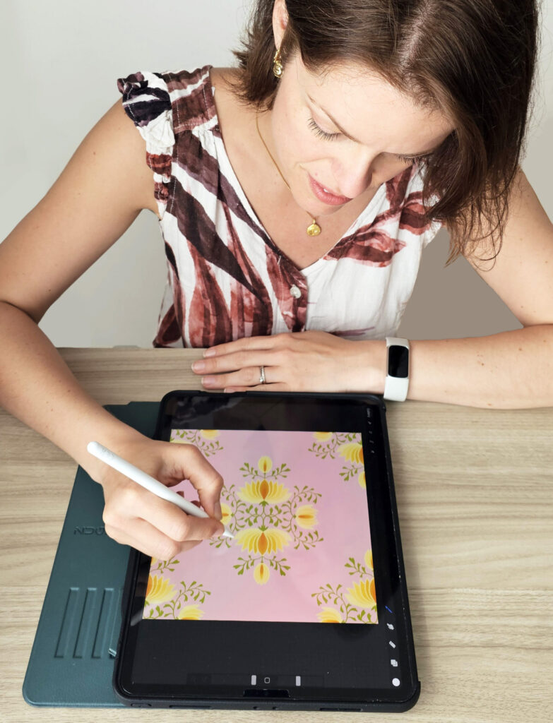
A step-by-step guide for surface pattern designers ready to go deeper — into their work, their story, and the market waiting for both.
There’s a moment most pattern designers recognise. You’ve made something you love. A beautiful floral, a geometric that really sings, a motif that somehow captures exactly the feeling you were after. You post it, people respond, and then… what? You make another single pattern. And another. And slowly your portfolio starts to look like a very lovely jumble sale — lots of beautiful things that don’t quite belong together. If that sounds familiar, this post is for you.
Because the shift from designing patterns to designing pattern collections isn’t just a technical upgrade. It’s a creative and commercial transformation that changes how buyers see your work, how companies respond to your portfolio, and — perhaps most importantly — how you feel about what you’re making.
Let’s dive in.
Why Collections Change Everything
Before we get into the how, it’s worth really understanding the why. Because “design in collections” is advice you’ve probably heard before — but the reasons behind it are more compelling than most people explain.
The commercial reason
Here’s something that doesn’t get talked about enough in artist circles: when a brand or manufacturer licences a pattern collection, they’re not just buying pretty designs. They’re buying a product range.
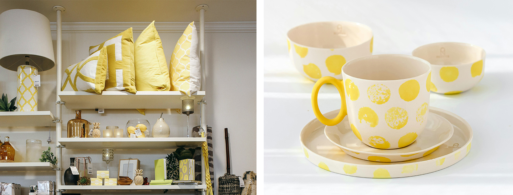
Think about how a homeware brand works. They don’t sell one cushion. They sell a cushion, a throw, a set of placemats, a tote bag, a set of cards — all designed to live together in someone’s home, to sit in the same display in a shop, to photograph beautifully as a lifestyle flatlay. For that to work, they need patterns that speak the same visual language. A hero print that makes a statement. Supporting prints that coordinate without competing. Blender patterns that add texture and versatility without demanding attention.
A single pattern, however beautiful, gives them one piece of a puzzle they need in full. A collection gives them the whole picture — and dramatically reduces the work on their end. That is why companies who license art prefer collections. It’s not a trend or a preference. It’s a practical reality of how products are made and sold.
The artistic reason
Collections also make you a better designer. When you’re designing a single pattern, every decision is relatively isolated. You can change your mind about the colour, the scale, the mood. But when you’re designing a pattern collection, every decision ripples outward. The colour you choose for your hero print has to work across six other designs. The motifs have to relate to each other. The overall feeling has to be coherent.
That constraint — which sounds limiting — is actually creatively liberating. It gives you a framework. It asks you to commit to a vision and then execute it with intention. Most designers find that their best work happens inside collections, because the brief is so clear and the decisions are so purposeful.
The story reason
There’s a third reason, and in 2026 it might be the most important of all. We’ve written before on this blog about the growing value of human-made art — the idea that as AI-generated imagery floods the market, the work that stands out is the work that feels specific, felt, and made by an actual person with a point of view. Pattern collections are where that specificity lives. A single pattern can be beautiful in a way that’s hard to trace. A pattern collection tells a story that is unmistakably yours.
Where did this collection come from? What were you thinking about, looking at, feeling? What memory or place or season inspired it? Those answers are not decorative extras. They are increasingly what buyers — both individual customers and commercial clients — are looking for and connecting with. The story behind a pattern collection is part of its value.
Which brings us neatly to where every great collection begins.
Step 1: Finding Your Theme — Start With Your Life, Not Pinterest
This is the step most designers skip, or rush through, or outsource to a trend report. And it’s the step that makes the biggest difference.
The designers whose collections feel alive and distinctive — whose work you recognise instantly even without a watermark — are almost always the ones who build from the inside out. They start with something real. Something personal. Something that only they could have noticed or cared about in quite that way.
I’ve learned the importance of the story behind a pattern collection from two successful designers I’ve been learning from, Bonnie Christine and Cass Deller. Bonnie says that the richest creative work comes from your own experiences, memories, places you’ve loved, feelings you’ve carried. Cass teaches the same holistic philosophy I love — the idea that a collection should have an emotional centre, a reason for existing beyond “this is on trend right now.” (I took Cass’s amazingly comprehensive pattern design course when was just starting out. It’s a treasure trove of everything you need to know about this industry. You can read about my experience here.)
This isn’t just idealistic advice. It’s also strategically smart. Because when a collection has a genuine emotional core, that core comes through in the work — even when the viewer can’t articulate it. It’s the difference between a pattern collection that looks nice and one that makes people stop and feel something.
The Theme Exercise
Set aside an hour — away from screens if you can. Grab a notebook and work through these prompts honestly. Don’t edit yourself, don’t think about what will sell, don’t look at what anyone else is doing. Just write.
- Where have you felt most alive? Not just places you’ve been — but places where something in you opened up. The specific beach you keep returning to in your memory. Your grandmother’s garden. A city that changed how you saw colour. A room in your childhood home. Write down as many as come to you.
- What do you collect? Not just physical objects — though those count. What images do you save? What details do you photograph? What finds you wanting to look closer? These patterns in your attention are clues to your visual obsessions.
- What season, time of day, or quality of light do you return to? Many designers have a characteristic palette without realising it’s rooted in a specific light. The blue hour before sunset. Overcast mornings. The particular green of a garden after rain. What’s yours?
- What memory has strong visual detail? The smell of a market, the pattern on a tablecloth, the colours of a festival, the texture of a favourite coat. Memories with strong sensory detail are goldmines for collections.
- What are you drawn to in the natural world? Botanicals, shells, insects, birds, geology, weather, seasons — what do you actually find yourself studying, photographing, noticing?
- What mood do you want someone to feel when they look at this collection? Calm and grounded? Joyful and playful? Nostalgic and warm? Quietly luxurious? Write down a feeling before you think about what it might look like.
Once you’ve worked through these prompts, look back at what you’ve written and notice what kept coming up. The answer that recurred across several questions is usually the one worth exploring.
Your theme doesn’t have to be grand or complicated. Some of the most successful pattern collections in surface design are rooted in deeply simple things: the colours of a Portuguese courtyard. The feeling of early morning in a particular wood. The wildflowers that grow on a specific road. Specificity is strength, not limitation.
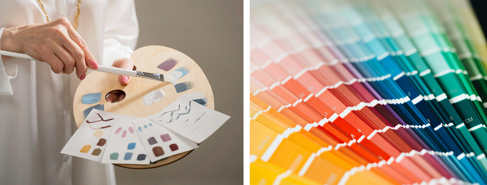
Step 2: Building Your Colour Palette — Choose With Feeling, Edit With Intention
Your colour palette is the thread that runs through every design in your pattern collection and ties it into a coherent whole. Get this right and even very different patterns will feel like family. Get it wrong and even technically brilliant patterns will feel disconnected.
Start with the feeling, not the colours
Before you open any software, go back to the mood you identified in Step 1. If you were designing a collection rooted in the memory of a wild coastal walk — wind, grey-green sea, pale stone, the pink of sea thrift — the emotional quality of that memory should lead you to your palette, not a colour trend report.
Ask yourself: what colours feel like this theme? Not what colours look like it literally, but what colours carry its emotional weight. Sometimes these are the same thing. Sometimes the emotional palette surprises you.
Try this: extract your palette from a photograph
One of my favourite ways to find a palette that truly carries a mood is to use a photograph as my source. Not a Pinterest mood board or a colour trend report — a real photograph, ideally one I took myself. A sunset, a garden corner, a weathered wall, a favourite coastline. Colours that draw me in. The magic of this approach is that nature and the world around us have already done the hard work. All the colours you need are quietly there, sitting in perfect relationship with each other — the shadows, the highlights, the subtle mid-tones that hold everything together. You don’t have to wonder if the colours work together. The light already decided that.
What I look for in a photograph isn’t just the obvious colours — the bright focal point or the dominant tone — but the quieter ones sitting in the edges and shadows. Those are often the shades that give a palette its depth and make it feel a little unexpected.
In practice, I use Photoshop or Procreate to sample colours directly from the image. In Photoshop, the eyedropper tool lets you pick individual shades precisely; in Procreate, you can simply tap the photo with your finger and hold for the colour to be selected. Once you have your swatches, you can adjust the saturation or lightness slightly to suit your designs — but the relationships between the colours, the underlying harmony, stays intact. The photo carries the mood, and when you extract from it, that mood comes with the palette. It’s one of those practices that feels almost like cheating because the results are so consistently beautiful.
How many colours?
For most pattern collections, a working palette of 6 to 10 colours gives you enough versatility without losing cohesion. Within that:
- 2 to 3 anchor colours — the dominant tones that will appear most frequently and define the collection’s overall feel
- 2 to 3 supporting colours — mid-weight tones that provide contrast and allow variation across patterns
- 1 to 2 accent colours — used sparingly, these add energy and prevent the palette from feeling flat
- 1 to 2 neutrals — cream, warm white, soft grey, or a muted tone that acts as breathing space
Test before you commit
Before you design a single pattern element, test your palette by creating simple colour swatches and living with them for a day or two. Put them next to each other in every combination. Do they all get along? Is there tension you didn’t expect? Is the palette too safe, or is it genuinely interesting?
A useful test: cover your swatches and describe the palette from memory. If you can’t quite articulate the colours — if they’re slightly unexpected — that’s often a good sign. Generic palettes are easy to describe. Distinctive ones are harder.
Allow colour to carry personality across the collection
One of the joys of working in pattern collections is using colour variations to give each pattern its own personality within a shared language. Your hero print might use all the anchor colours at full strength. A blender might use just two or three in softer, more muted tones. A small ditsy print might be offered in three different colourway options, each shifting the mood slightly.
This variety — while staying within the same colour family — is what makes a pattern collection feel rich and commercially versatile.
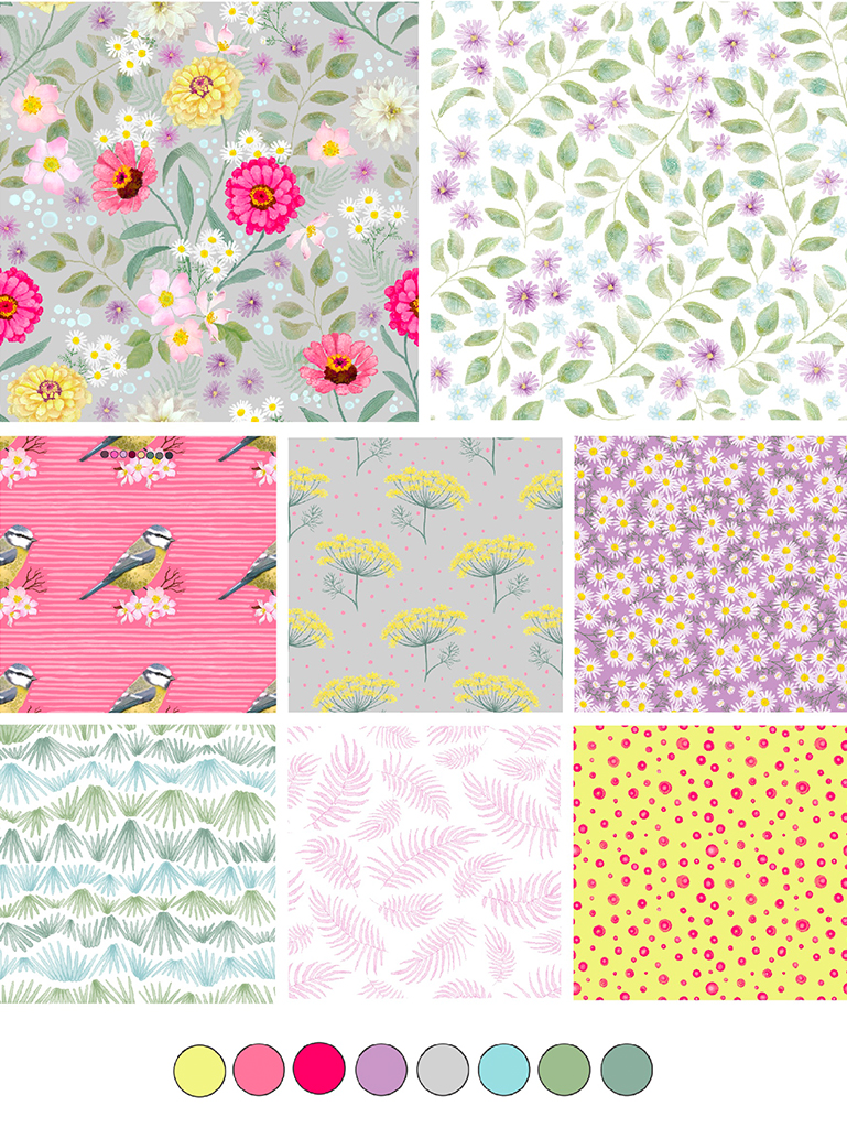
Step 3: Designing the Collection — What Patterns You Need and Why
This is the structural heart of the process, and it’s where having a clear framework makes everything easier. A well-designed pattern collection typically contains what commercial designers call a print hierarchy: different types of patterns that serve different functions and work together across scale and complexity.
The Hero Print
This is your statement piece. The pattern that carries the full emotional weight of your theme, uses your palette at its boldest, and makes the first impression.
Hero prints are typically large scale — the kind of pattern that reads well on a cushion, a tote bag, a metre of fabric, a wallpaper panel. They’re complex enough to reward close looking but clear enough to read from across a room. If your collection were a book, the hero print would be the cover. You generally only need one hero print per collection, though two can work if they’re distinct enough in scale or mood.
Supporting Prints
These are the patterns that work alongside your hero — sharing the same motif vocabulary and colour palette but at a different scale, density, or interpretation. Where the hero is bold, a supporting print might be medium-scale and more contained. Where the hero is maximalist, the supporting print might offer breathing space. Think of these as the prints that round out the story. If your hero is a lush, layered floral, a supporting print might be a simpler geometric using the same colours, or a half-drop of a single motif drawn from the hero design.
Aim for 2 to 3 supporting prints.
Blender Patterns
Blenders are the unsung heroes of a great pattern collection. Small-scale, lower-contrast, and quietly textural — they exist to coordinate with everything else without demanding attention. Micro dots, fine stripes, mini florals, subtle geometric grids, tone-on-tone textures. Blenders are commercially incredibly valuable. They allow manufacturers to mix patterns within a product range without visual chaos. They work at any scale. They give buyers flexibility.
Include 2 to 3 blenders in every collection.
The Coordinates
Beyond the core print hierarchy, many designers also include one or two coordinate patterns — designs that are slightly more standalone than blenders but still unmistakably part of the same family. These might be a stripe in the collection palette, a simple check, or a geometric that echoes the structure of the hero motifs.
So — How Many Patterns in Total?
A solid, commercially viable collection contains 6 to 12 patterns. For a first pattern collection, 6 to 8 is a completely achievable and respectable range. That might look like:
- 1 hero print
- 2 supporting prints
- 2 to 3 blenders
- 1 coordinate
Don’t let the number overwhelm you. Start with the hero, let everything else flow from it, and build outward. You can check out my Heirloom Cottage collection for examples.
Step 4: Keeping the Collection Coherent — The Details That Hold It Together
You’ve got your theme, your palette, your print hierarchy. Now the work begins — and so does the challenge of keeping everything feeling like one collection rather than several nice patterns that happened to be made at the same time.
Here are the things to keep returning to as you design:
Consistent motif vocabulary. The visual elements in your pattern collection should feel related — not identical, but drawn from the same world. If your theme is coastal and your hero features sea glass, pebbles, and kelp, your supporting prints and blenders should draw from the same natural vocabulary. Not the exact same elements necessarily, but the same spirit.
Consistent line quality and render style. If your hero is painted in loose watercolour, your blenders should carry some of that same quality — even if they’re simpler. Mixing a painterly hero with a crisp, vector-sharp blender creates visual dissonance that buyers feel even if they can’t name it.
Consistent scale relationships. The prints in a collection should vary in scale in a way that feels intentional. Large, medium, small — with clear differences between them. If all your prints are roughly the same scale, the collection loses its visual range and commercial versatility.
Return to the mood. Keep coming back to the feeling you identified in Step 1. Every time you’re unsure about a decision — a colour, a motif, a scale — ask: does this serve the mood? Does this feel like the same collection? If not, why?
Step 5: Naming and Writing the Story — The Part Most Designers Skip
Your collection needs a name. Not just for administrative purposes — but because the name is the first act of storytelling, and storytelling is increasingly how collections sell.
A great collection name is evocative rather than descriptive. It hints at the feeling rather than cataloguing the contents. “Botanical Study” tells you what’s in it. “The Green Hours” makes you feel something.
Think about the memory, place, or mood that inspired your collection and find the words that carry its atmosphere. Keep it short — two or three words at most. Say it out loud and notice if it sounds like something worth remembering.
Once you have a name, write a short collection story — 3 to 5 sentences that describe what inspired it and what feeling it’s designed to create. This isn’t marketing fluff. It’s genuinely important. For individual buyers on Etsy, a story creates connection and emotional investment. For commercial buyers, it signals that your work has intention, depth, and a designer behind it who thinks in more than just aesthetics.
In a world where AI can generate a technically competent pattern set in minutes, the story behind a pattern collection is part of what makes yours irreplaceable. It’s evidence of a human being — of a particular life, a particular eye, a particular moment of creative attention. Don’t throw that away by leaving it unspoken.
Step 6: Presenting Your Collection — How to Show It at Its Best
A beautiful collection presented badly is a missed opportunity. And yet presentation is where so many artists run out of steam.
Here’s what a well-presented collection looks like, whether you’re sharing it on your portfolio, your Etsy shop, or pitching it to a commercial client:
Show the collection together first. Before you show individual patterns, show the whole family. A flat lay or a grid of all the patterns together — ideally at consistent scale — lets the eye understand the collection’s coherence and range at a glance. This single image should do a lot of work.
Show scale and context with mockups. Flat pattern files are necessary, but they don’t tell the whole story. Show your collection on products — cushions, tote bags, wallpaper, fabric, stationery, wrapping paper, whatever suits the mood of the collection. Mockups help buyers visualise the commercial potential and help individual customers imagine owning something.
Show colourway variations if you have them. Even offering your hero print in two colourways significantly increases commercial appeal. It shows range without creating extra design work.
Write individual descriptions that connect back to the story. Don’t just describe what the pattern looks like. Connect it to the collection’s theme. “Drawn from the textures of sea-washed pebbles and the particular grey-green of the Atlantic in October” tells a buyer something that “a repeating circle pattern in muted tones” simply doesn’t.
Keep your portfolio presentation consistent. If you’re building toward commercial licensing, a consistent, clean presentation — same background colours, same mockup style, same format — signals professionalism and makes your portfolio easier to navigate for a busy art director.
A Note on Trend Alignment — Using It Without Being Consumed by It
There’s a tension that every designer navigates: the pull between personal creative vision and commercial relevance. Between making what you love and making what will sell. Here’s the perspective that I find most useful: trends are navigation tools, not briefs. They tell you where the market’s attention is moving. They don’t tell you what to make.
The most enduring collections are ones where a designer’s genuine creative voice happens to intersect with where the market is heading — or where the collection is strong enough to create its own relevance. The goal isn’t to chase trends. It’s to understand the cultural and commercial landscape well enough to know where your work fits within it.
If your theme leads you somewhere that aligns with a current trend — the return to folk art, the appetite for organic and handmade textures, the quiet luxury movement, the storytelling imperative — wonderful. Use that alignment consciously and articulate it. If your theme leads you somewhere less obviously trending, trust it anyway. The collections that feel the most specific and personal are often the ones that find the most loyal audiences, because they’re genuinely irreplaceable.
To learn more about how to use trends while staying true to your own style read my previous blog post here.
Your First Collection — A Simple Starting Point
If you’ve never designed a collection before and all of this feels a little overwhelming, here’s the simplest possible place to start:
Pick one memory — a specific place, a specific time of year — that you could describe in vivid visual detail. Write down five words that capture how it feels. Pull five colours from those words. Draw ten motifs that belong in that world. Build a hero print from the most evocative of them. Let everything else grow from there. That’s it. That’s the beginning. The rest — the print hierarchy, the colourway variations, the story, the mockups — comes after. Start with one real thing and let it lead you.
The Bigger Picture
Designing in collections isn’t just a better way to organise your work. It’s a different way of thinking about what you’re making and why. It asks you to commit to a vision. To build something with depth and coherence. To bring your whole self — your memories, your observations, your aesthetic instincts — into service of a single idea, explored fully.
That kind of intentional creative work is exactly what the market is moving toward. Not just individual buyers who want something beautiful, but companies who are actively seeking designers with a distinctive voice and the craft to sustain it across a range of work. Your collection is not just a product. It’s a conversation. It says: this is how I see the world. This is what I noticed. This is the feeling I wanted to make tangible.
And somewhere, there is a buyer — on Etsy, in a design agency, in a product development office — who has been looking for exactly that. Make it easy for them to find you.
Enjoyed this? You might also love my series The Human-Made Advantage — exploring why human creativity is becoming more valuable in the age of AI, and how to lean into what makes your work irreplaceable. Read Part 1 → | Read Part 2 →